| (16 intermediate revisions by the same user not shown) | |||
| Line 1: | Line 1: | ||
| − | |||
= Home = | = Home = | ||
| Line 5: | Line 4: | ||
== Purpose == | == Purpose == | ||
| − | The | + | The Home page of Icertis Contract Intelligence or your personal dashboard is designed with the following goals: |
| + | *Track tasks | ||
| + | *Take actions | ||
| + | *Access information of importance<br/> | ||
| − | + | | |
| − | + | == Collapsible Main Menu == | |
| + | The tiles appearing at the top of the Home page represent the different entities within ICI. The entity tiles displayed on your Home page will depend on the authorization you have.<br/> The entire tiles bar is a collapsible unit, allowing you more visual space as required. Click the arrow to hide (or show) the main menu. | ||
| + | <div class="image-green-border">[[File:8.0-home-collapsible-menu.png|520px|8.0-home-collapsible-menu.png]]</div> <div class="image-green-border"> </div> | ||
| | ||
| + | == Global Search Bar == | ||
| + | <div class="image-green-border">The search bar is displayed when the main menu is set to “Show Menu”. When the main menu is collapsed, only a search icon is displayed alongside the other top-right menu options. Clicking this search icon displays the search bar.<br/> <br/> Here, you can enter a search term and press enter or click the search icon to view the context of the specific term entered.</div> <div class="image-green-border"> </div> <div class="image-green-border">[[File:8.0-global-search-bar.png|520px|8.0-global-search-bar.png]]<br/> <br/> You can access [[Using_Advanced_Search|Advanced Search]] through its dedicated link on the home page. <br/> </div> | ||
== Top-right menu == | == Top-right menu == | ||
| − | + | <div class="image-green-border">[[File:8.0-home-top-right.PNG|720px|8.0-home-top-right.PNG]]</div> | |
| − | *'''Create''': The | + | *'''Create''': The Plus icon is a quick access menu to create agreements and access other areas of the application. |
| − | *'''Notifications''': This bell icon indicates Notifications where a red dot signifies new/unread messages and clicking it will direct you to the | + | *'''Notifications''': This bell icon indicates Notifications where a red dot signifies new/unread messages and clicking it will direct you to the [[Notifications_Dashboard|Notifications_Dashboard]]. |
| − | *'''Activity''': The | + | *'''Activity''': The user-and-time icon indicates the Activity Panel, which opens a drawer and can be refreshed to reflect the latest activities. |
*'''Help''': Clicking this question icon opens the Help link in a new tab. | *'''Help''': Clicking this question icon opens the Help link in a new tab. | ||
| − | *'''User Settings''': Clicking the User Settings icon opens a drawer menu for users to update their preferences such as theme color and time-zone. Refer [[Basic_Set_Up]] for more details. | + | *'''User Settings''': Clicking the User Settings icon opens a drawer menu for users to update their preferences such as theme color and time-zone. Refer [[Basic_Set_Up|Basic_Set_Up]] for more details.<br/> |
| + | == Dashboard Configuration == | ||
| + | A default dashboard is provided with the application. This dashboard is completely configurable. Here’s what you can do: | ||
| − | + | *Customize the dashboard by adding widgets, reports, KPIs and other relevant information. | |
| + | *Arrange and resize the widgets in a manner that works best for you. | ||
| − | + | Your admin team can design a dashboard that suits your organization’s requirement and make it available to you. If you are an admin user, please go to [[Dashboard_Configuration|Dashboard Configuration]] for information on configuring dashboards for your users.<br/> | |
| − | + | ||
| − | + | ||
| − | + | == Available Widgets == | |
| − | + | ||
| − | + | ||
| − | + | ||
| − | + | ||
| − | + | ||
| − | + | ||
| − | + | ||
| − | + | ||
| − | + | ||
| − | + | ||
| − | + | ||
| + | === Personalized Widgets === | ||
| + | |||
| + | Here’s a list of widgets that display information directly associated with you: | ||
| + | |||
| + | *What would you like to do - The widget “What would you like to do” is a default dashboard widget allows users to take quick actions via pre-configured links, presented as line items, from the ICI Home page. It can be configured to provide multiple actions/links with one quick action line item. | ||
| + | |||
| + | [[File:QuickActions1.png|480px]] | ||
| + | |||
| + | *My Recent Activities | ||
| + | *My Tasks | ||
| + | *Notifications | ||
| + | <div class="note-box">'''Note''': The options displayed in the "What would you like to do?" widget can be defined by your technical configuration team.</div> | ||
| + | |||
| + | === <br/> Report Widgets === | ||
| + | |||
| + | Many report-based widgets including Power BI reports can be added to the dashboard. Here’s a list: | ||
*[[Legal_and_Compliance|Agreement Deviation Report]] | *[[Legal_and_Compliance|Agreement Deviation Report]] | ||
| Line 54: | Line 67: | ||
*[[Admin_Reports|Signature Type Report]] | *[[Admin_Reports|Signature Type Report]] | ||
*[[Workflow_Reports|Templates Pending Approval Report]] | *[[Workflow_Reports|Templates Pending Approval Report]] | ||
| − | *[[Admin_Reports|User Login Report]] | + | *[[Admin_Reports|User Login Report]]<br/> |
| − | + | === Saved Searches Widgets === | |
| + | <div class="image-green-border"> </div> <div class="image-green-border">Saved searches for which you have access based on your security group or organization can be added as widget to the dashboard.<br/> Refer [[Saved_Searches|Saved_Searches]] for information on how to save a search result.</div> | ||
| + | === <br/> Business Application Widgets === | ||
| + | <div class="image-green-border"> </div> <div class="image-green-border">If you have access to one or more Icertis Business Applications, there are dashboard widgets for applications that you can add as well.<br/> </div> | ||
| + | == Working with Widgets == | ||
| − | + | Here’s what you can do with widgets: | |
| − | + | *Moving Widgets | |
| + | *Adding Widgets | ||
| + | *Resizing Widgets | ||
| + | *Widget Interactions | ||
| − | + | === Moving Widgets === | |
| − | + | ||
| − | + | ||
| − | + | 1. Click the "Edit Dashboard" [[File:8.0-edit-dashboard.PNG|120px|8.0-edit-dashboard.PNG]]button.<br/> 2. Click and drag the "Move" [[File:8.0-edit-dashboard-move.PNG|RTENOTITLE]]icon to move the widget. | |
| − | + | ||
| − | + | ||
| − | + | ||
| − | + | ||
| − | + | ||
| − | + | ||
| − | + | === Adding Widgets === | |
| − | + | 1. Click the "Edit Dashboard" [[File:8.0-edit-dashboard.PNG|100px|8.0-edit-dashboard.PNG]]button.<br/> 2. Click the "Add Widgets" [[File:8.0-add-widgets.PNG|100px|8.0-add-widgets.PNG]]button.<br/> 3. From the list of widgets, select one or more widgets you want to add to the Dashboard. | |
| − | === | + | === Resizing Widgets === |
| − | + | 1. Click the "Edit Dashboard" [[File:8.0-edit-dashboard.PNG|100px|8.0-edit-dashboard.PNG]]button.<br/> 2. Click and drag the "Resize" [[File:8.0-edit-dashboard-resize.PNG|30px|8.0-edit-dashboard-resize.PNG]]icon to resize the widget. | |
| − | + | On increasing the widget width, more columns are displayed and correspondingly lesser number of columns are displayed when the width is reduced. | |
| − | + | ||
| − | + | ||
| − | + | ||
| − | | + | Depending on the size of the widget, the reports are displayed in graphical form or as KPIs. |
| + | <div class="image-green-border">[[File:8.0-reports-widgets.png|520px|8.0-reports-widgets.png]]<br/> </div> | ||
| + | === Widget Interactions === | ||
| + | |||
| + | "Three-dots" icons displays the following Actions: | ||
| + | |||
| + | *Preview Document | ||
| + | *View Smart Links | ||
| + | *Copy Record | ||
| + | *View Details | ||
| + | |||
| + | On stretching to the full width of the dashboard all five columns available for the widget are displayed. On reducing the width, the widget dynamically resizes and the number of columns is adapted to up to two columns including a column with the "View Details" [[File:8.0-edit-dashboard-view.PNG|RTENOTITLE]]and "Actions" [[File:8.0-edit-dashboard-actions.PNG|RTENOTITLE]]icons. Here you can directly click on the View Details or eye icon to open the record in a new tab.<br/> | ||
| + | |||
| + | == ICI Version and Browser Compatibility Information == | ||
| + | |||
| + | To find out ICI Version Information, | ||
| + | |||
| + | 1. '''Scroll down''' the page till the end. | ||
| + | |||
| + | 2'''. Click''' "About" on the lower-left corner of the ICI page. | ||
| + | |||
| + | The drawer with two tabs displays the following information : | ||
| + | |||
| + | '''ICI Platform Version tab''' | ||
| + | |||
| + | *'''Product Version''': displays the version of ICI | ||
| + | *'''Icertis Experience for Word''': displays the version of ICI Word Add-In. | ||
| + | *'''Terms of Use''' | ||
| + | *'''A link''' ''“''Open Source Information” is displayed below the “Terms of Use” section at the bottom. The link opens in a new browser tab displaying the information of the multiple open-source software being used in the application.<br/> | ||
| + | |||
| + | '''Browser Compatibility tab''' | ||
| + | The Browser Compatibility tab''' '''displays the information in a tabular format consisting of compatible browsers with versions and the operating systems that supports these versions. | ||
| + | <div class="image-green-border"> </div> | ||
| | ||
Latest revision as of 10:46, 12 May 2022
Contents
Home
Purpose
The Home page of Icertis Contract Intelligence or your personal dashboard is designed with the following goals:
- Track tasks
- Take actions
- Access information of importance
Collapsible Main Menu
The tiles appearing at the top of the Home page represent the different entities within ICI. The entity tiles displayed on your Home page will depend on the authorization you have.
The entire tiles bar is a collapsible unit, allowing you more visual space as required. Click the arrow to hide (or show) the main menu.
Global Search Bar
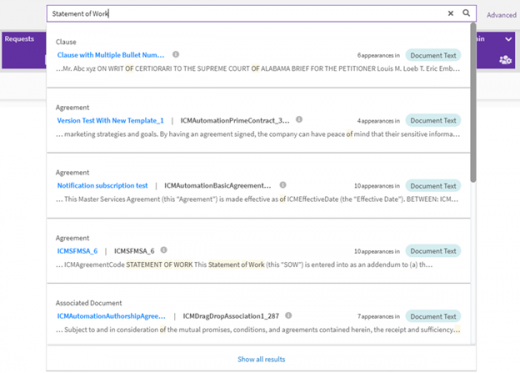
Here, you can enter a search term and press enter or click the search icon to view the context of the specific term entered.
- Create: The Plus icon is a quick access menu to create agreements and access other areas of the application.
- Notifications: This bell icon indicates Notifications where a red dot signifies new/unread messages and clicking it will direct you to the Notifications_Dashboard.
- Activity: The user-and-time icon indicates the Activity Panel, which opens a drawer and can be refreshed to reflect the latest activities.
- Help: Clicking this question icon opens the Help link in a new tab.
- User Settings: Clicking the User Settings icon opens a drawer menu for users to update their preferences such as theme color and time-zone. Refer Basic_Set_Up for more details.
Dashboard Configuration
A default dashboard is provided with the application. This dashboard is completely configurable. Here’s what you can do:
- Customize the dashboard by adding widgets, reports, KPIs and other relevant information.
- Arrange and resize the widgets in a manner that works best for you.
Your admin team can design a dashboard that suits your organization’s requirement and make it available to you. If you are an admin user, please go to Dashboard Configuration for information on configuring dashboards for your users.
Available Widgets
Personalized Widgets
Here’s a list of widgets that display information directly associated with you:
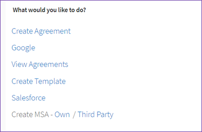
- What would you like to do - The widget “What would you like to do” is a default dashboard widget allows users to take quick actions via pre-configured links, presented as line items, from the ICI Home page. It can be configured to provide multiple actions/links with one quick action line item.
- My Recent Activities
- My Tasks
- Notifications
Report Widgets
Many report-based widgets including Power BI reports can be added to the dashboard. Here’s a list:
- Agreement Deviation Report
- Agreements Pending Approval Report
- Agreements Pending Execution Report
- Approved Requests Waiting for Contract Creation Report
- Average Agreement Turn Around Time Report
- Clauses Pending Approval Report
- Expired Agreements Report
- Expiring Agreements Report
- Signature Type Report
- Templates Pending Approval Report
- User Login Report
Saved Searches Widgets
Refer Saved_Searches for information on how to save a search result.
Business Application Widgets
Working with Widgets
Here’s what you can do with widgets:
- Moving Widgets
- Adding Widgets
- Resizing Widgets
- Widget Interactions
Moving Widgets
1. Click the "Edit Dashboard" button.
2. Click and drag the "Move" icon to move the widget.
Adding Widgets
1. Click the "Edit Dashboard" button.
2. Click the "Add Widgets" button.
3. From the list of widgets, select one or more widgets you want to add to the Dashboard.
Resizing Widgets
1. Click the "Edit Dashboard" button.
2. Click and drag the "Resize" icon to resize the widget.
On increasing the widget width, more columns are displayed and correspondingly lesser number of columns are displayed when the width is reduced.
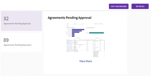
Depending on the size of the widget, the reports are displayed in graphical form or as KPIs.
Widget Interactions
"Three-dots" icons displays the following Actions:
- Preview Document
- View Smart Links
- Copy Record
- View Details
On stretching to the full width of the dashboard all five columns available for the widget are displayed. On reducing the width, the widget dynamically resizes and the number of columns is adapted to up to two columns including a column with the "View Details" and "Actions"
icons. Here you can directly click on the View Details or eye icon to open the record in a new tab.
ICI Version and Browser Compatibility Information
To find out ICI Version Information,
1. Scroll down the page till the end.
2. Click "About" on the lower-left corner of the ICI page.
The drawer with two tabs displays the following information :
ICI Platform Version tab
- Product Version: displays the version of ICI
- Icertis Experience for Word: displays the version of ICI Word Add-In.
- Terms of Use
- A link “Open Source Information” is displayed below the “Terms of Use” section at the bottom. The link opens in a new browser tab displaying the information of the multiple open-source software being used in the application.
Browser Compatibility tab
The Browser Compatibility tab displays the information in a tabular format consisting of compatible browsers with versions and the operating systems that supports these versions.
Related Topics: Agreement Management | Associations | Compliances | Templates | Clauses | Configure | Reports | Advanced Analytics| Admin | ICI_Tools | AI Apps | ICI_Add-ins | Integrations | ICI_Mobile_App | ICI_BOT | Release_Notes | Advanced Search | Agreement Details | Notifications | | Bulk Actions |


